

.jpg)
Three fundamental principles of Photography that have not changed since the 1800’s:
1. Getting the correct exposure
2. Focus
3. Today it’s all about “making a compelling composition”
When we talk about composition we often talk about the compositional rules or laws, and I want to state at the beginning, ALL RULES ARE MADE TO BE BROKEN. But first you must know the rules, understand what and why we have them, follow them and break them when it makes sense.
You will also see some of these rules contradict each other. That is when you must choose which one to use in order to make the image you have in your mind. And that is what this is all about, telling the story of what you see and how it makes you feel, then conveying that to others. Composition is about visual story telling. You want to lead your viewer on a journey through the image and to your subject.
Some Terms and Definitions First
So, let’s first define a few things. Most important, what is composition. It’s how we arrange elements within the scene we have framed. Within photography, this could also include what we choose to focus on and what we choose to have out of focus. The challenge for photographers, compared to painters or other visual artists is, we are working with physical objects within a physical space, with limited control over their placement. You will have a hard time moving the Arch ten feet to the left to have a well-balanced image. A painter can put it wherever they want, plus they have time to make these decisions, where often in photography we have fleeting light, we are trying to capture at the “decisive moment”, weather, and the physical location that we can’t change. These are all things we deal with.
When the word framing is used, I’m talking about everything you see that will be in your photo which I will talk about in rule #10: Frame within the Frame as a rule.
Choosing your Aspect Ratio
Let’s talk for a second about aspect ratio or frame size. Your camera most likely is a 2:3 ratio. This comes from the 35mm film format days and was carried over into digital. Interestingly, 4:3 is often sighted as the full peripheral aspect our eyes see, but 16:9 is considered the natural sweet spot and is the current aspect of most TV’s and screens. In photography we historically made 8x10 prints, which is 4:5 ratio (also a traditional film format). As a photographer you get to choose the ratio you want to use from square to wide panoramic (pano), vertical or horizontal. Here are some common ratios we shoot and print in.
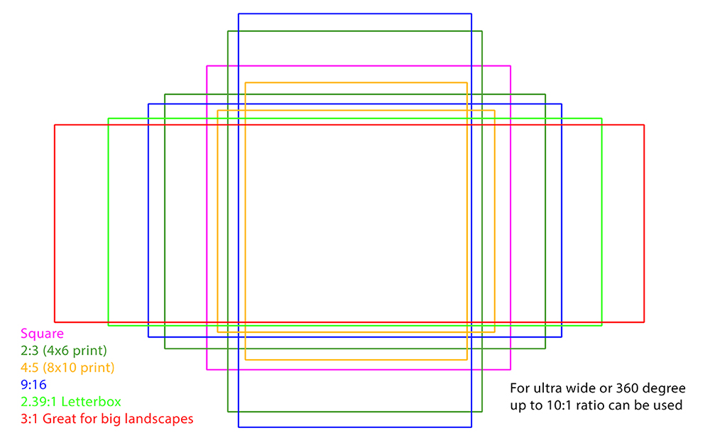
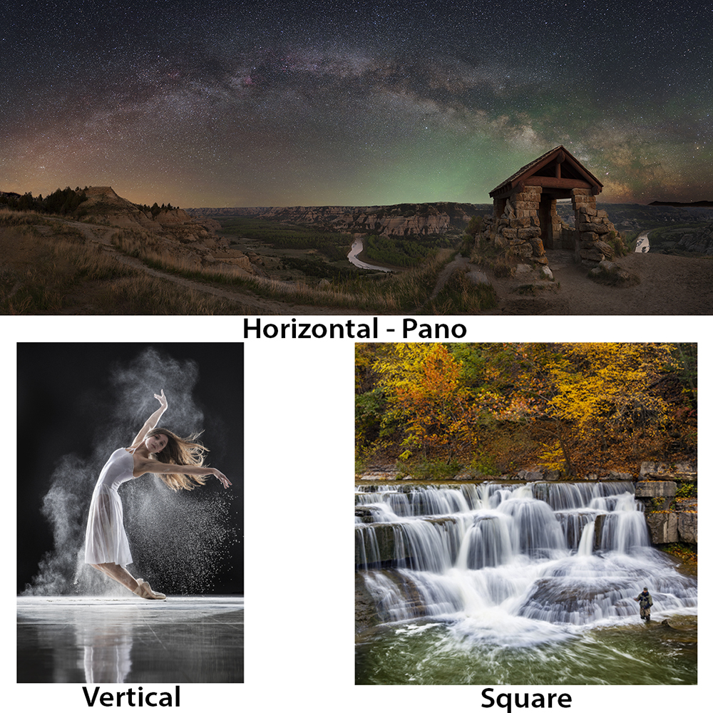
You want to think about which ratio you want to use before composing your image and taking the photos. Start with 2:3 because that is what your camera is set up for and it will be easiest. I often shoot square and wide pano’s as well as 2:3, as the subject and story I’m telling dictates. Wide pano’s make for great large print landscape vistas and squares are just for a fun challenge (and it’s the ratio of the Hasselblad medium format camera a lot of photographers love to use).
Vertical and horizontal alignment is usually dictated by the subject. The rule of thumb is, if you have horizontal lines in your framing, use horizontal alignment, and vertical lines (or subject, like a portrait) you go vertical. No need to over think this one, go with what feels right.
Fill the Frame but Leave Some Space
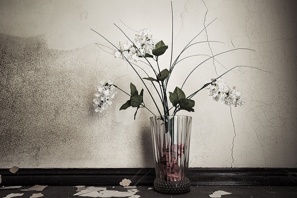
We want to fill the frame with what is important to tell the story, but no more. Often what we choose to leave out is just as important and what is in the photo. Keeping your photograph as simple as possible is often a good rule of thumb.
12 Rules of Composition
Depending on who you talk to or what design book you read, there are a lot of rules. To keep this as short as possible, we are going to stick with the more common rules, and the ones that photographers often fallback on to.
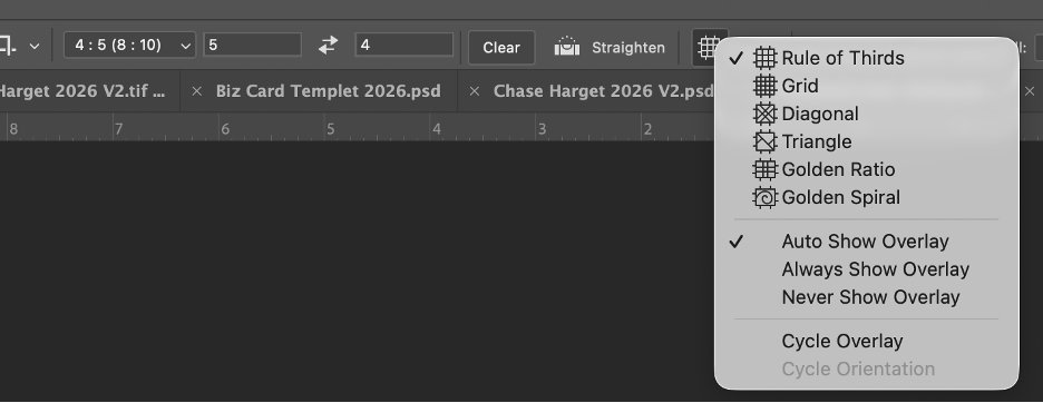
The first four“rules” are all overlays in Photoshop (PS) when you use the crop tool. You can choose the rule as an overlay by selecting the one you want to use from the pull-down menu. There is also a simple grid you can use if you are cropping and just want to make sure everything is level and square. Most modern digital cameras will also have the rule of thirds as an overlay you can display as you’re shooting, some even have the golden rectangle.
#1: Rule of Thirds
This is probably the easiest rule to learn and is the one you should start with for a few reasons. It is simple, your camera probably has an overlay you can turn on, and most other compositions are either based on it, or you can see it within those other rules.
It is simple, you divide your framing into thirds by making two equal vertical and two equal horizontal lines. Then you put your subject into one of the four intersections, and your horizon should be on either of the two horizontal lines.
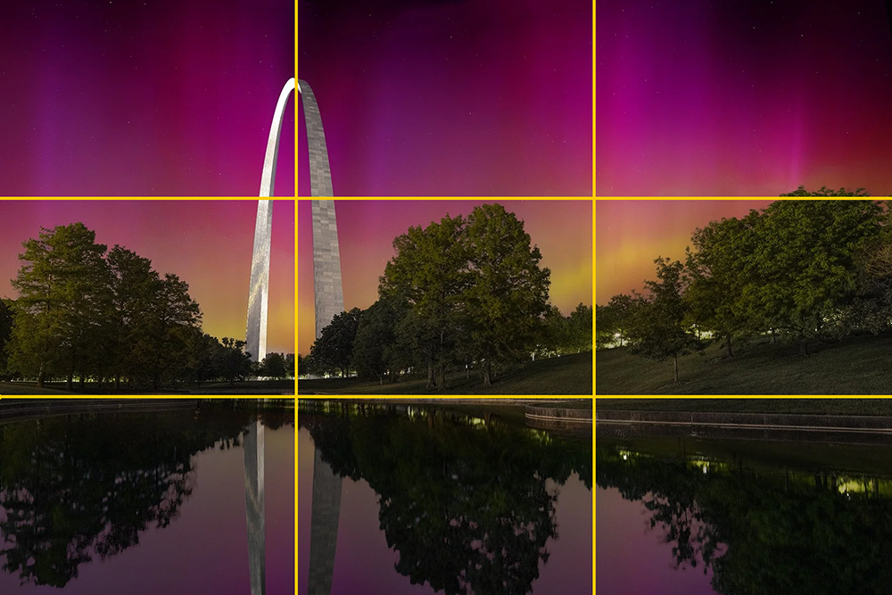
Some will tell you never to use the rule of thirds, mainly because it is overused. When you are first learning, it is the best to start with, just ignore what the art snobs say and make a great image.
#2: Golden Rectangle (Golden Ratio in PS)
Like the rule of thirds, you divide the image with two vertical and two horizontal lines, but unlike the Rule of Thirds, they are not equal. They are closer together, pulling your subject more centered. This is great for showing a subject in a large space, where you want to show a lot of the environment.
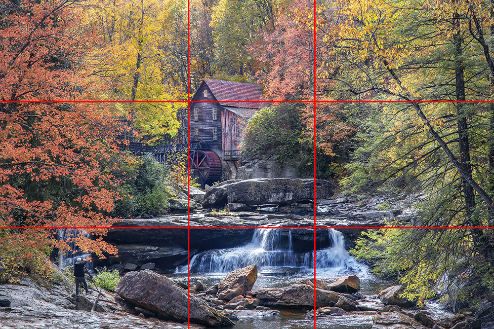
#3: Golden Triangle (Triangle in PS)
This one has nothing to do with the Golden ratio. Draw a line from one corner on top to the opposite corner on bottom. Then from the other two corners, draw lines to meet the first line at 90-degree angles forming four triangles. Placing the subject where either of the lines connect.

#4: Fibonacci Spiral (Golden Spiral in PS)
This is a self-repeating spiral based off the Golden Ratio. There is a lot of history and information about this and books have been written, so I will only talk about how we use it. The concept is your eye will enter the image where there is less detail and is about a third of the image. Then as the curve moves, your eye will follow as you get into more interesting, but smaller sections until you finally get to the subject.
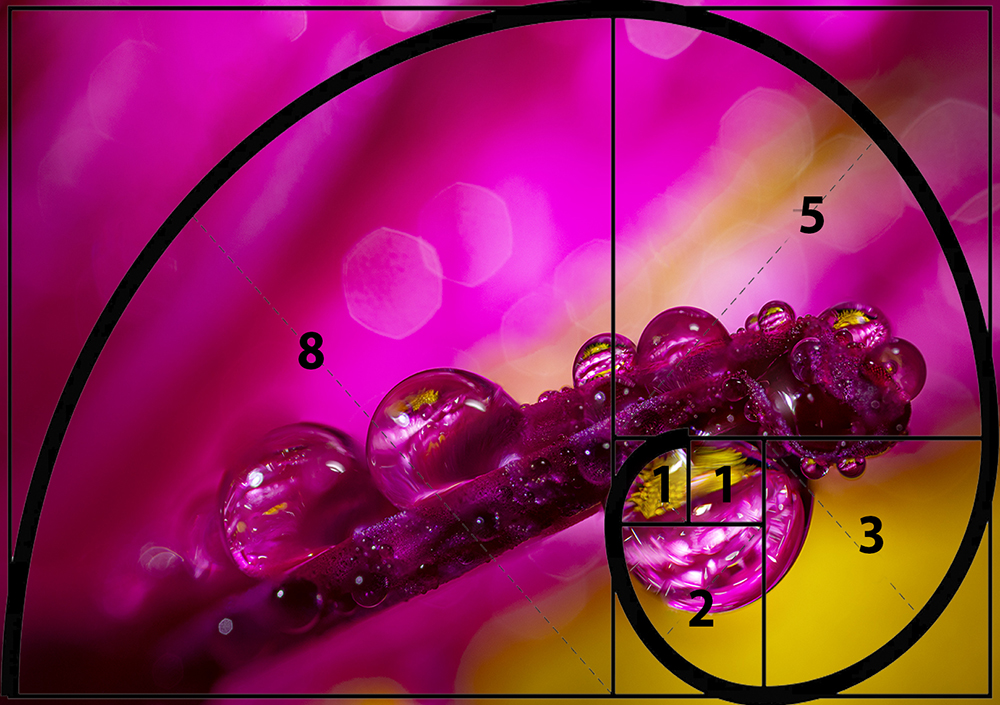
#5: Leading Lines
Sometimes these are actual lines like a fence or road, but often they are lines formed by two different subjects, tones, or colors meeting. Here you want all lines leading toward your subject, drawing or leading the viewer’s eyes to your subject.
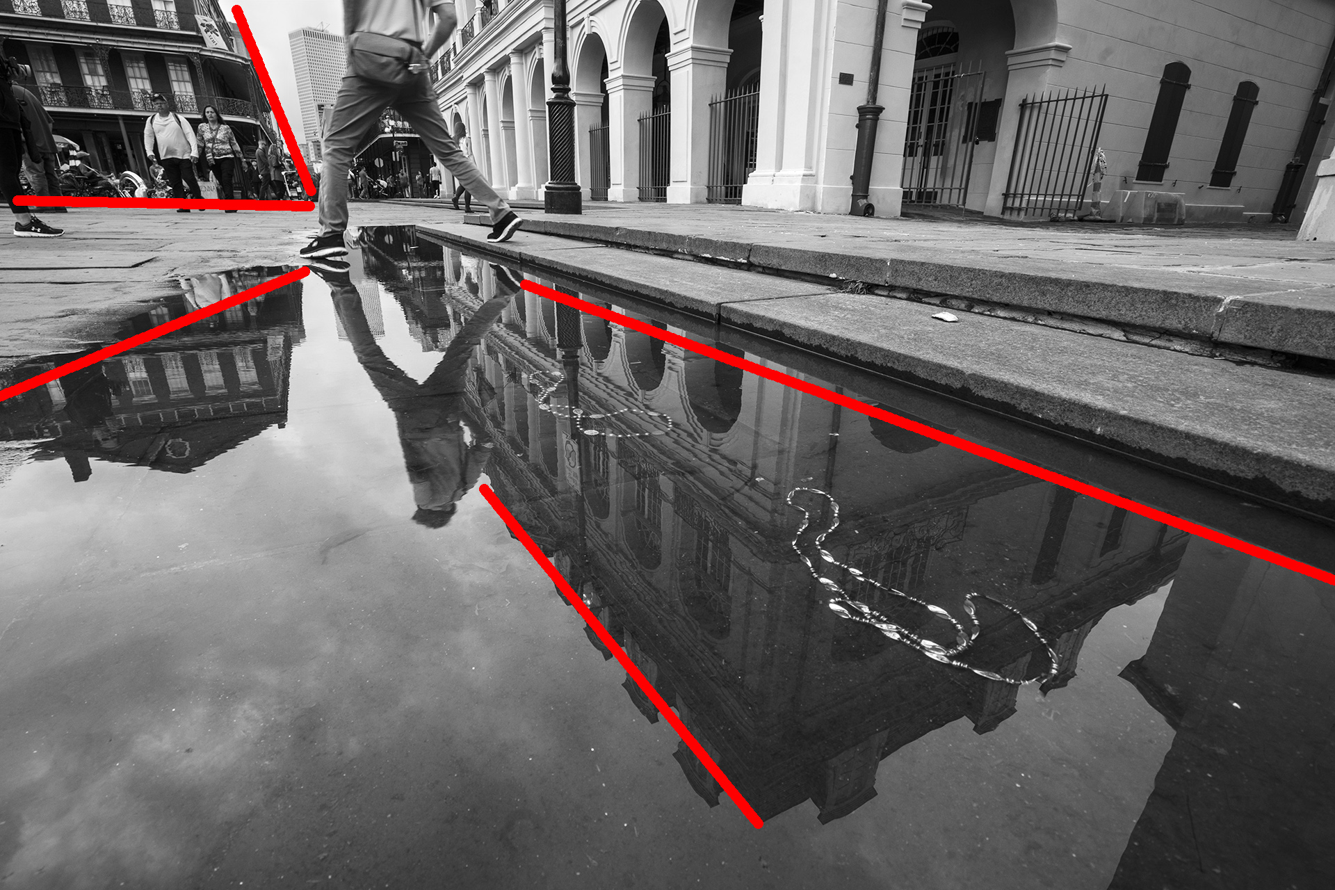
#6: S-Curve
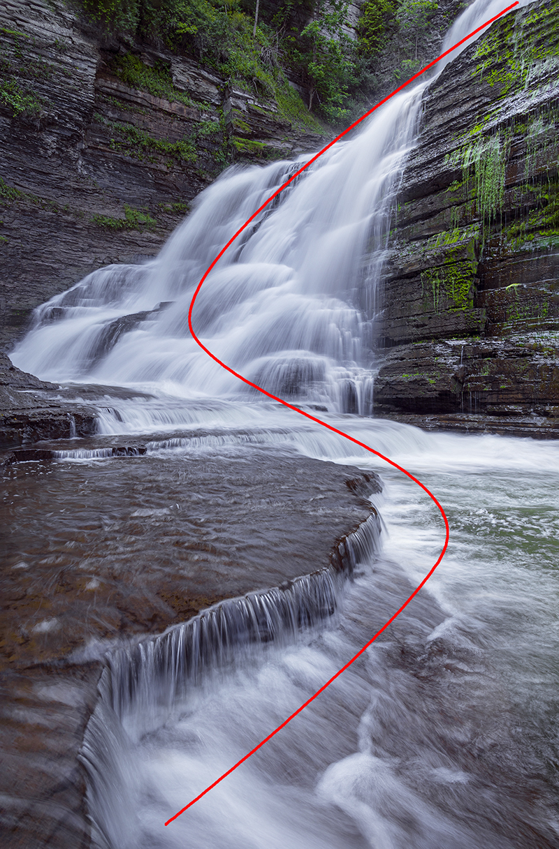
The idea here is to have a path moving through the image in a smooth but not straight line. These work well when photographing actual paths and roads, but as the example shows, the flow of this waterfall and river also works. The S-Curve is gentler than a straight line and often conveys relaxation. A variation on this is the continuous curve where you allow the imagination of the viewer to continue past the frame.
#7: Rule of Three or Odds
This comes from psychology where people generally find an odd number of subjects more balanced than an even number. This applies when you have multiple subjects and generally you want your main subject as the center one. Once you get to a large number like a team or flock of birds, this rule becomes both impractical and meaningless.

#8: Foreground, Mid-Ground, Background: Create Depth
In photography you are translating a three-dimensional subject into a two-dimensional representation. By having a defined foreground,mid-ground, background you create a space for your viewer to explore.Two-dimensional art tends to look more graphic and you will often see this in artwork from the far east. It is something I also do when doing minimalism images.

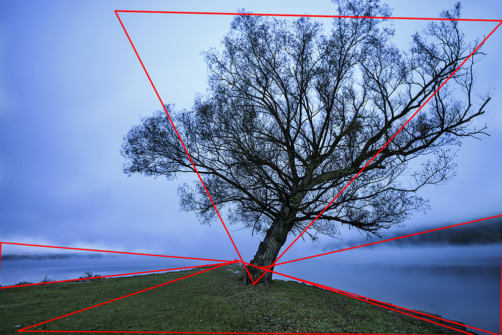
#9: Diagonals and Triangles
This is a more complex rule and it’s often hard to visualize. I find painters using this more often because they have more time and control of the subject and supporting elements. I use it in the studio when doing product photography but honestly have never used it while doing landscape. When using some of the other rules together, you can naturally build this kind of composition.
#10: Frame within the Frame
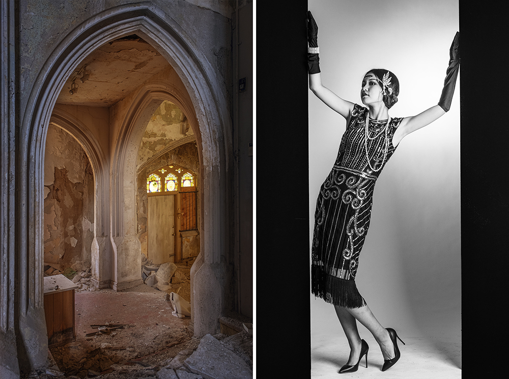
This can be a fun one if you take it literally and works well in nature when it is more subtle or understated. Often in landscape you may have two trees framing your main subject or even mountains. In street and architectural photography, you’re using man-made features. You’re creating a border around your subject to add depth and direct your viewer’s eye. I’ve used a circular spot behind a subject as well.
#11: Contrast, Tone and Color
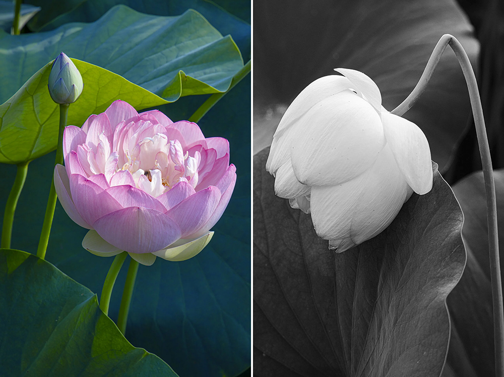
This can be obvious or subtle. I will often cool down the shadows by moving their color balance toward blue while warming up the highlights. The viewer will not notice this right off; it works more subconsciously. Then other times, going over the top with strong color or tonal contrast works great. Again, this is one of those rules that the subject dictates which way you go.
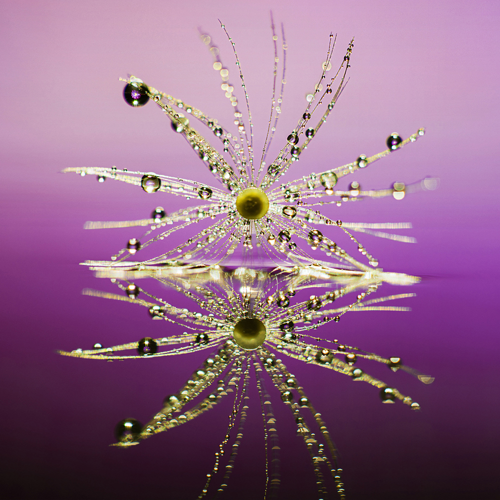
#12: Center Composition Symmetry
This one goes against almost every other rule here. But in some cases, it is the perfect solution. Put your subject dead center and have symmetry on both sides. The symmetry doesn’t have to be the same supporting elements; it can be similar tones or colors.
In Conclusion
There are more rules out there, but these are a great starting point. You will not use all of them at once and will often break them on purpose to add drama or tension. Generally, you want your subject to be the brightest object because the eye gravitates to the light, but a silhouette will go opposite this to build mystery and suspense. You also generally want your subject looking into the frame, but if they are looking out, not towards the center of the frame you are now telling a story of adventure or dreaming.
In general, you want to know the rules and then you can decide when to follow them and when to break them. You want to let your subject, the mood you want to set, and the story you are telling dictate which rules you follow and when to break them.